Thursday 13 December 2012

Lea and Perrins: Peer Assessment

Further Developed Prototype


I updated the look of my product by incorporating ampersands with the recycling logo to make my target market aware that Lea and Perrins have changed as a brand and are making there packaging more sustainable. I decided to make my sleeve the full length of the bottle for stacking on shelves, completely minimising my label, and decided I would make the bottle black and orange like the special edition bottle, to make it look more attractive

Full Length Sleeve using recycling logo and ampersand
view from the side
recipe card displayed on the back, can detach  

Again, my group liked the bold simplicity of my design - one of the aims that I was hoping to achieve they also thought that I had a good range of ideas they just thought I should further expand on my bottle in order to make it better.

Sunday 2 December 2012

Lea and Perrins: Prototype


For the next part of the main brief, I was aware of my materials and design, so I decided to do a 3D Prototype of my design and display to my group to show my progress.

My First Prototype 
My Group liked the simplicity of my prototype and also liked how it still looked rustic even though the brand is trying to appeal to a younger audience but I wanted to further develop it into something not as simple I could do this by incoporating my two main chosen symbols which was the recycling logo and a exclamation mark.
and turning my bottle neck into a sleeve that would cover the bottle


Lea and Perrins: Design Development


-->  
Computer Generated Images
There is nothing quite like Lea and Perrins; it is a unique taste. It simply gives your food that extra oomph. The exclamation mark is a visual expression of this while providing great standout on shelf and a strong architecture capable of building in recipe suggestion. this is a two part label, and is smaller than the current one, using less materials and could perhaps be transformed into a recipe book.


I Incorporated the recycling logo with ampersands to make buyers aware that the product they are buying is sustainable.


further sketches


Saturday 1 December 2012

Bottle Neck Holder Concept


 As I continue with my main brief I decided to look further into the materials I would be using "Recycled Paper" and "Soy Ink Printing" and what kind of bottle necks I could use for my design.

Recycled Paper
Recycled paper offers the same quality as non-recycled paper and it requires less energy, water and chemicals to manufacture. Using recycled paper is a simple way to work responsibly.
the process of paper recycling involves mixing used paper with water and chemicals to break it down. It is then chopped up and heated, which breaks it down further into strands of cellulose, a type of organic plant material; this resulting mixture is called pulp, or slurry. It is strained through screens, which remove any glue or plastic that may still be in the mixture then cleaned, de-inked, bleached, and mixed with water. Then it can be made into new paper.


Soy/Vegetable Ink 

liquid based made from a variety of vegetable oil such as
  • corn
  • walnut
  • coconut
  • linseed
  • soy beans
They do take longer to dry than normal inks however they are made from renewable sources.
Can be cleaned with water based cleaner.
Easier to de-ink when recycling, much less hazardous waste.
As opposed to traditional Petroleum-based ink, soy-based ink:
  • is more Environmentally friendly
  • is available in brighter colors
  • improves the life span of the printers
  • makes it easier to recycle paper
  • is more economic in the long run

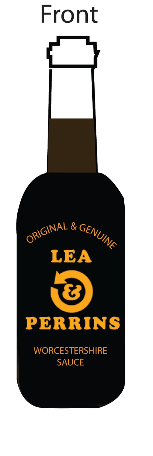
As I proceed with my design concept, I decided to look at current Bottle Neck design holders to see if I could get inspired... If I produce a bottle neck using recycled paper and vegetable soy ink it would not only look good but will be a little bit more green than the current bottle.

did you know... About 35% of municipal solid waste (before recycling) by weight is paper and paper products.

Inspiration
I like these ideas of using bottle neck for my packaging


Session Task: Innocent Smoothies Case Study

In order to help us for our main brief of investigating sustainable materials For our session task we had to look at companies that were doing the same thing and how they have altered their packaging in order to be more Green friendly.
The company I chose was Innocent Smoothies.


There claim is that they want their packaging to have the lowest possible impact on the world as possible.

Here are their tips on how to be more sustainable with packaging:
  • Use less: as little material as possible per pack
  • Don't use up new stuff: go for as much recycled and/or renewable material as possible
  • Close the loop: use materials and pack formats that are easy to recycle
  • Lower its impact: deliberately avoid high carbon materials 
 There bottles are made from PET which stands for polyethylene terephthalate, a plastic resin and a form of polyester. which can be recycled widely as it does not contain BPA. Most single-serve plastic bottles, including those for water, soft drinks and juices, are made with PET. PET is globally recognized as a safe, recyclable packaging material. Numerous tests have created a broad scientific consensus that PET is non-toxic and is a safe material for the storage of food and beverages. Facts on PET supports the efforts of regulators to ensure that plastics are safe for the public through scientific testing and analysis.

Tuesday 20 November 2012

Lea and Perrins: Initial Ideas

Initial Ideas

There was many design considerations I thought of for my main brief, I began by looking at the current bottle and seeing what I could do in order to change it to make it more appealing to a younger audience ...

I noticed that there was elements on the bottle that were perhaps unnecessary such as  the fancy border and the portraits of Lea and Perrins, and a crest near the top. I prefer more simplistic designs and feel that gives it more of a modern twist.
So I would bare this in mind and completely simplify my design.

Idea #1: Using Trademarks on String Tied Label.

I liked the idea of using local Landmarks such as Sabrina Bridge and Worcester Cathedral on the bottle label in a orange Pop art style and be tied on the bottle using string. The only problem I had with this design is perhaps was still a bit to traditional and a bit dated and may not appeal to my target market

 
I liked the idea of producing a quirky Collection of bottles using symbols such as stars and dots this would give my bottles a modern edge the label would be minimised so it was smaller, meaning less materials would be used.


Idea #3: Using Ampersands & Recycling logo to incorporate "Lea & Perrins" using a bottle neck hanger, no label.